Arctic Travels
Role

Timeline
Tool

The Problem
Arctic Travels is a premium travel agency specialising in tailor made skiing and snowboarding holidays. Despite offering high end experiences, their digital presence did not reflect the luxury, clarity, or ease of booking that their audience expects.
The existing process lacked visual inspiration, intuitive navigation, and trust building information which made it difficult for users to confidently plan and book their trips.
The Solution
The goal was to deliver a polished, intuitive, and trustworthy booking experience that balances luxury aesthetic with practical usability, to allow users to feel confident as they plan their bespoke ski holiday.
Specifically the client wanted inspiring photographs, a cool-toned palette and bold call-to-action buttons (CTAs). With inspiration drawn from sites like Booking.com and Expedia for the landing page and user experience.
My design process followed the Double Diamond framework, grounding every decision in user research and iterative testing to deliver a premium, intuitive booking experience
Through user interviews and competitor analysis, I identified common frustrations in mainstream travel sites which included cluttered layouts, hidden fees, and overwhelming upsells. I addressed these directly by simplifying the search interface, limiting options per screen to reduce cognitive load, and applying Hick’s Law to present only essential choices at each stage.
I introduced a side by side trip summary to increase pricing transparency, and contextual upgrades appeared only after users confirmed their core booking which enhanced trust and prevented decision fatigue.
To maintain a consistent premium feel, I implemented a cool-toned colour palette, immersive photography, and bold CTAs that guided users clearly through their journey. The layout and typography were optimised for both desktop and mobile, with responsive adjustments ensuring balance and readability across devices.
The final design transforms complex trip planning into a confident, effortless experience, combining luxury, clarity, and usability to make bespoke ski holidays feel both aspirational and achievable.
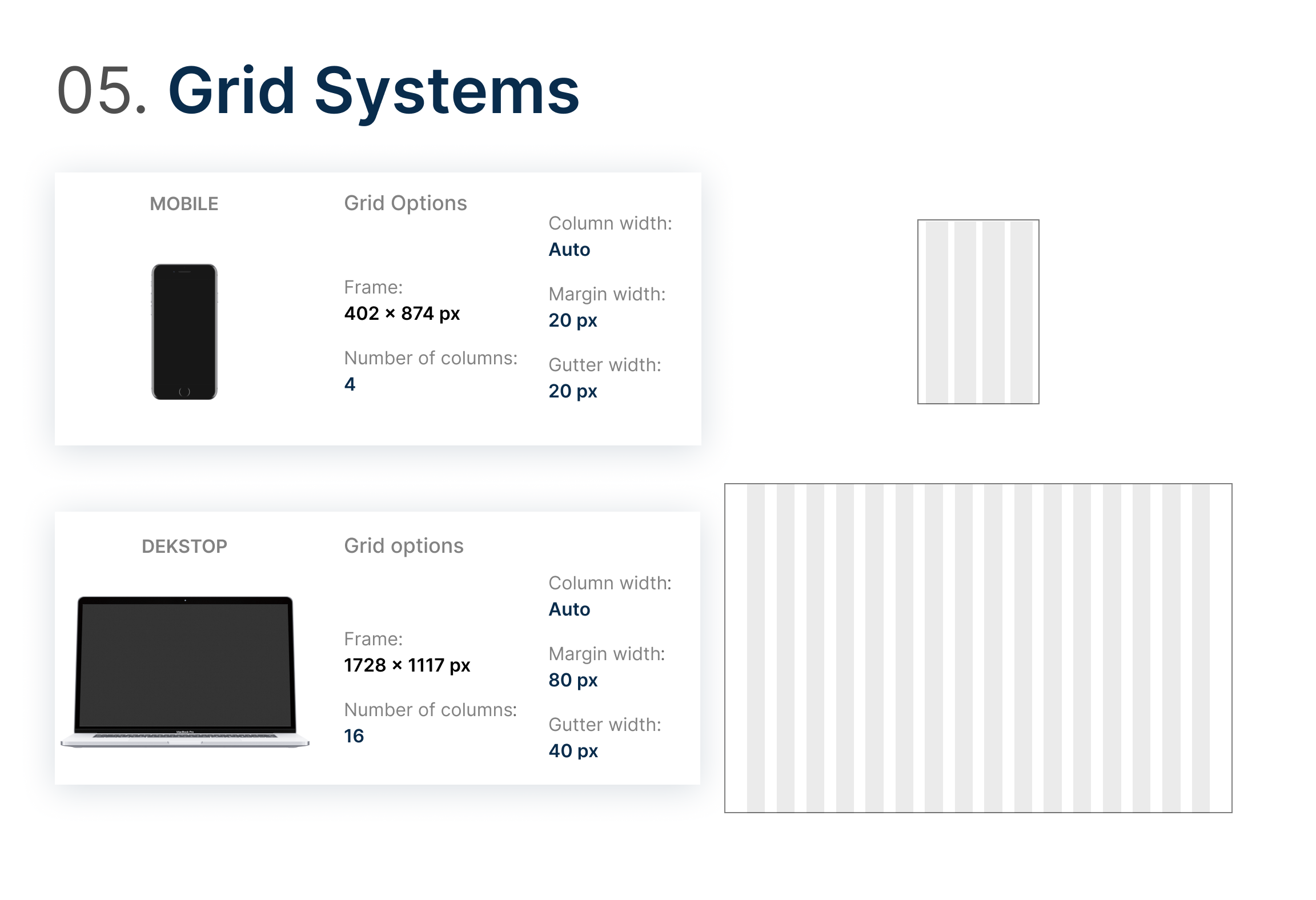
Double Diamond Design Process
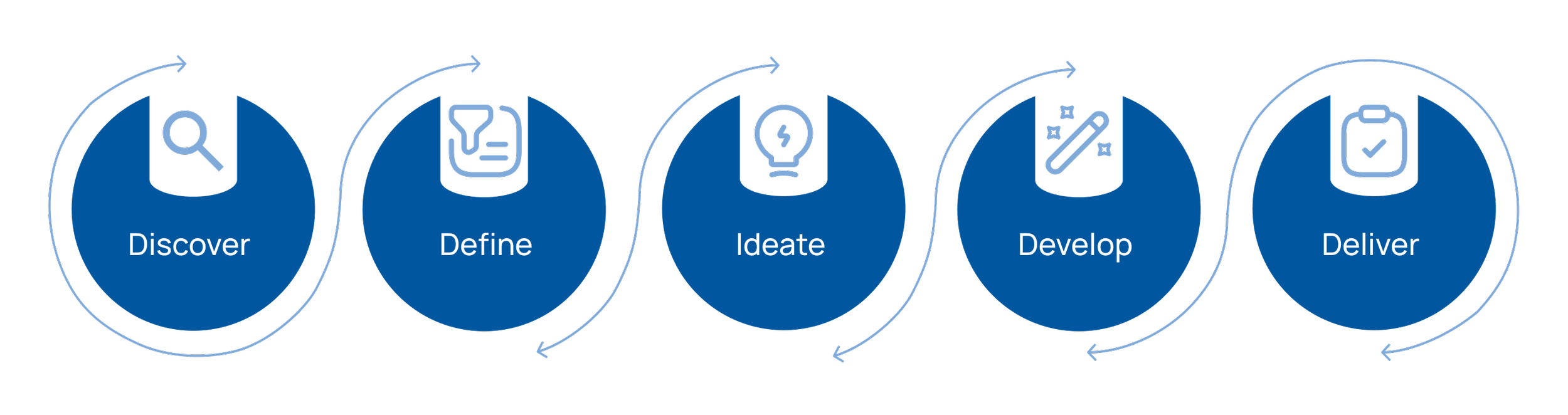

Discover & Define
Moodboard
Following the brief, user research and personas, I understood that my target audience was likely to be those aged 25-55 years old who enjoy adventurous luxury winter holidays that are well priced, visually appealing and easy to book. With this in mind I aimed to create a polished, modern interface that provides professional guidance for a seamless booking process.


-
The client requested cool-toned colours to reflect typical ski holiday branding. I used an analogous palette of blues and greens with neutral tones for balance and accessibility.
#7FAADA / #C9ECF9 – blue hues inspired by clear winter skies.
#767778 / #CCD3D9 – greys for contrast and structure.
#73A486 / #CBFEDE – greens drawn from natural alpine scenery, ideal for CTA buttons.
#9A8F86 / #F3EEE6 – warm browns reflecting ski lodges and adding depth.
Together, these colours create a calm, cool, and cohesive winter aesthetic.
-
For the typefaces, I wanted to balance luxury with functionality. Script fonts felt elegant but were hard to read, so I ruled them out. I first explored serif options like Cinzel Decorative Bold for headlines and EB Garamond Regular for body text, which conveyed trust and sophistication. I then tested sans-serif options for better digital clarity, including Montserrat and Bruno Ace, paired with Open Sans for readability. Ultimately, the clean, modern pairing of Bruno Ace and Open Sans best reflected a refined yet user-friendly aesthetic suited to a luxury travel brand.
-
My image inspiration reflected the client’s key themes and the emotions users should feel while browsing:
Mountains: Smooth, scenic views showcasing nature and the cool tones from the brief.
Ski Lifts: Vibrant images capturing the journey and panoramic scenery.
Skiing & Snowboarding: Action shots adding energy and variety to the experience.
Lodges/Resorts: Luxurious chalets and hot tubs conveying comfort and warmth.
Together, these images help users visualise the experience and feel inspired to book their holiday.
-
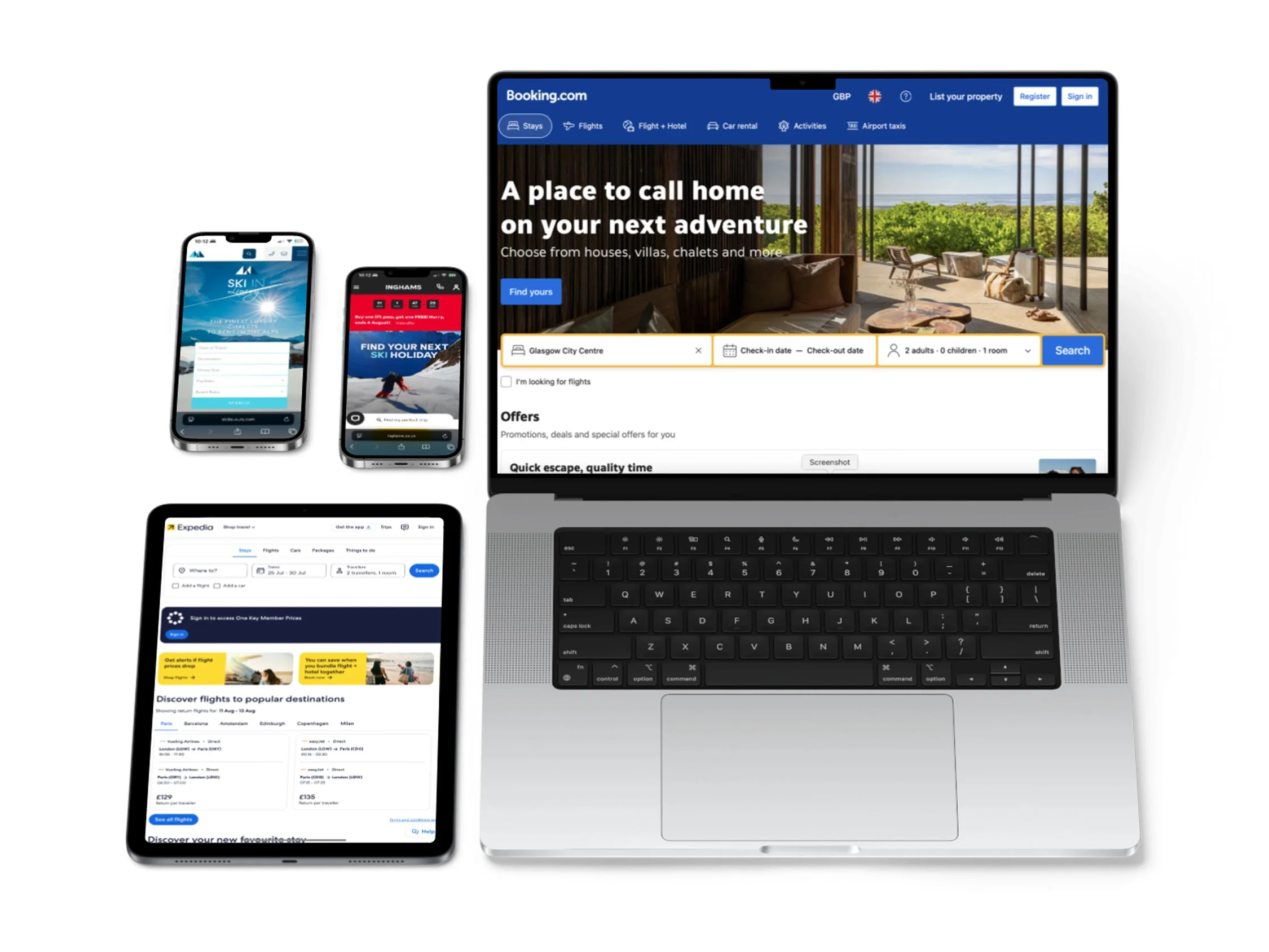
In line with the brief, the client wanted a landing page similar to Expedia or Booking.com, following Jakob’s Law that users prefer familiar designs. My research showed these sites use a bold search bar to capture attention and product cards to showcase options using similarity and proximity. I applied these principles across the destination and booking pages, ensuring a consistent, intuitive experience for users planning their ski holiday.
Competitor Analysis
I reviewed Booking.com and Expedia. I also reviewed two other websites, Inghams and Ski In Luxury, which I found to be very informative for my design. I completed identical tasks on each site to identify the pain points.
I then developed a list of positives and negatives for each function whilst making note of particular features that could influence my design.
User Interviews
Following my research above, I developed interview questions for three potential users so that I could better understand their needs and pain points. Below are a sample of the questions:
Can you tell me a bit about your most recent winter holiday?
How do you usually go about booking your holidays? What issues do you face?
What types of amenities or activities do you prioritise when searching for winter destinations?
What would an ideal booking experience look like for you?
What would make you recommend a booking platform to friends or family?

Key Insights

I use my mobile to book
holidays. It’s hard when the pages aren’t optimised
for mobile.

Key Insights

“ How might we design a modern, visually engaging travel platform that allows users to effortlessly plan, customise, and book luxury bespoke ski holidays while feeling confident, inspired, and supported throughout the process? ”

User Personas


Key Insights > Design Decisions
The ability to sift through information
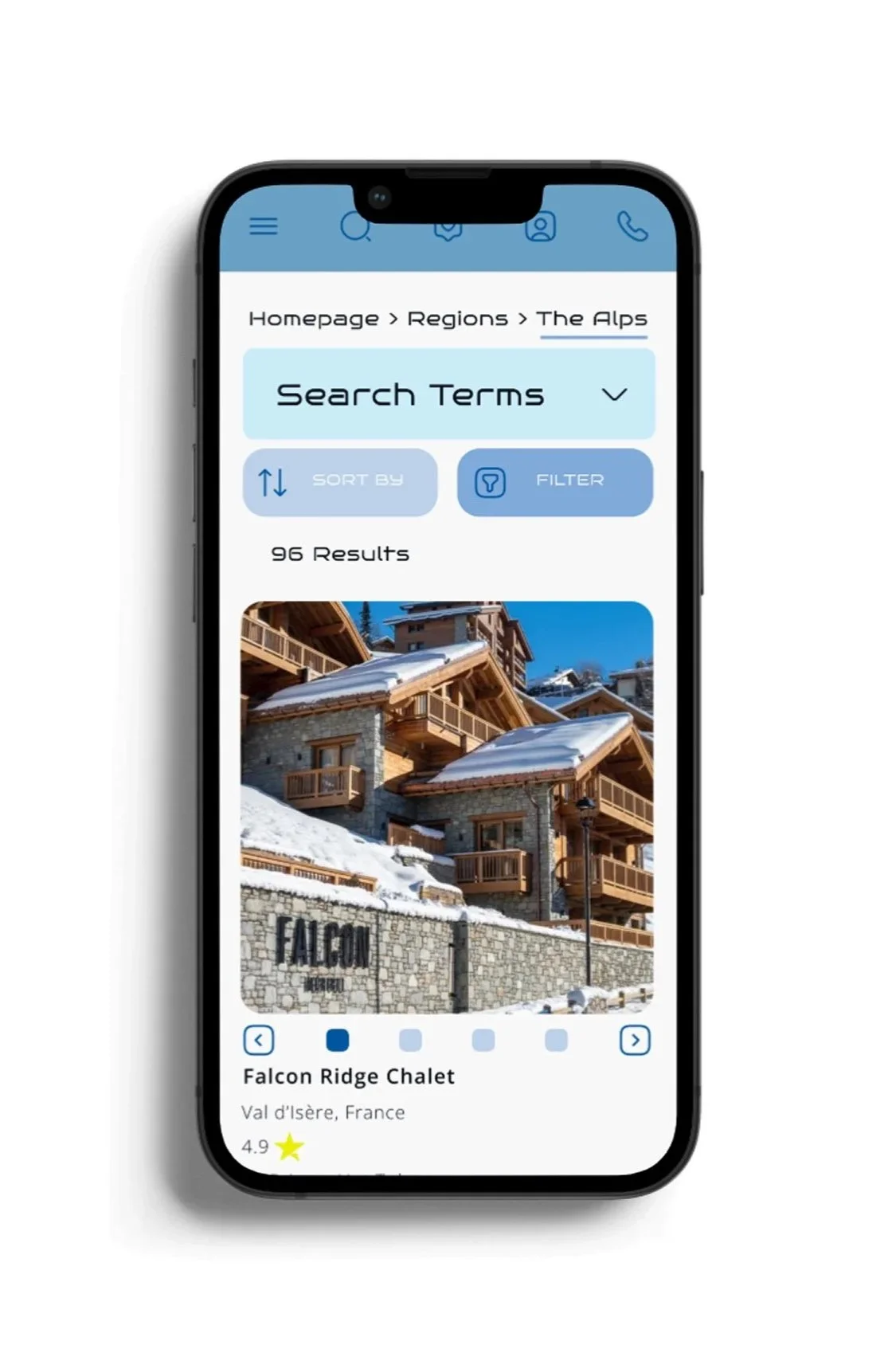
Filters and search options were designed with flexibility in mind: solo friendly resorts, child safe amenities, and spa inclusive lodging.

The need for visual prompts to entice users
I included visual storytelling throughout the platform to appeal to all types of users by using a variation of imagery.
Assistance whilst booking
I ensured that there were numerous points on the page to contact customer support
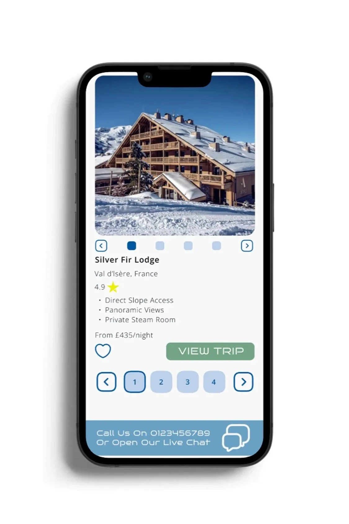
Reasonable and transparent pricing
I highlighted offers and the price match promise to reassure users that they are getting the best deal. The prices were clearly demonstrated with no hidden fees on checkout.

The requirement for customisation
Homepage highlights showing trip types such as "Couples Retreat", "Solo Escapes", and "Family Packages"
Before developing any interfaces for Arctic Travels, I created a clear Information Architecture (IA) and User Flow to establish how users would navigate through the platform and complete key tasks such as searching for lodges, making a booking, or managing their account. This allowed me to anticipate user needs, map out critical interactions, and structure the site in a way that reduced friction and increased clarity.
The IA ensures content is organised in a logical structure that mirrors how users think about planning a ski holiday starting with destinations, narrowing to resorts, then viewing lodges. This reduces cognitive load, so users don’t have to guess where to go next.
Information Architecture & User Flow

The IA was structured around four main user goals:
Discover ski holidays and extras (via regions, resorts, lodges, passes or special offers)
Search and filter lodges
Complete a booking flow
Manage bookings and account details
The hierarchy was designed to reflect mental models that users are already familiar with in travel platforms like Expedia or Booking.com.

The user flow outlines a primary journey from the homepage to booking confirmation, with several supporting and alternative paths:
Search flow: Users can filter results directly or browse via destination categories
Booking flow: Step-by-step booking with review, payment, and confirmation
Account management: Returning users can log in to access saved trips or manage bookings
Support flow: Options to contact support or download the itinerary

Develop & Deliver
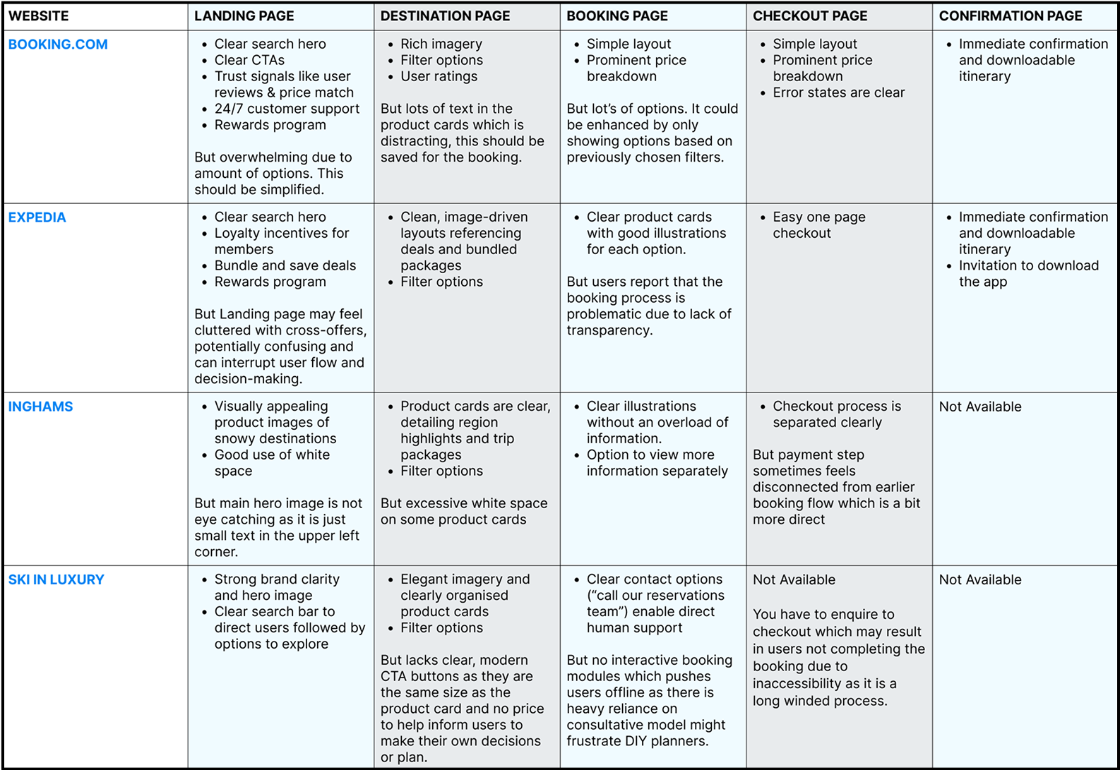
As users often browse of their mobiles, I made the CTAs tap-friendly and collapsible menus to allow for ease when scrolling and readability to ensure the interface was mobile responsive. As well as filters to optimise searches and create a streamlined process.
Another key focus was to make the visual hierarchy clear as users want quick access to options that matter to them. To do this, I highlighted the regions, resorts, lodges and passes on the front page and created filters for searching, including within spotlight offers so that it would stand out.
I created an intuitive navigation based on my information architecture and user flow to allow users to move seamlessly from browsing to booking and confirmation.
Whilst I wanted to focus on the imagery, I needed to ensure that the interfaces did not feel cluttered as I found this was common in my user research. I avoided this on mobile by using stacking and carousels to filter through content. I avoided this on desktop by using hierarchy and white space appropriately.
From my user research, I wanted to include upsells. To achieve this, I placed upsells on the confirmation page with the title “enhance your trip” to make it feel optional and contextual, rather than aggressive. It also added a sense of luxury as opposed to just displaying it as an add-on.
Wireframes
Desktop Wireframe
To guarantee visual coherence and accelerate hand off between a design team, I compiled a design system that documents every foundational choice behind the Arctic Travels interface.I also chose typography that I had identified within my research.
During the wireframe process, I Initially chose Cinzel Decorative as the typeface, however, I altered my designs on reflection as I did not feel as if it fit the brief.
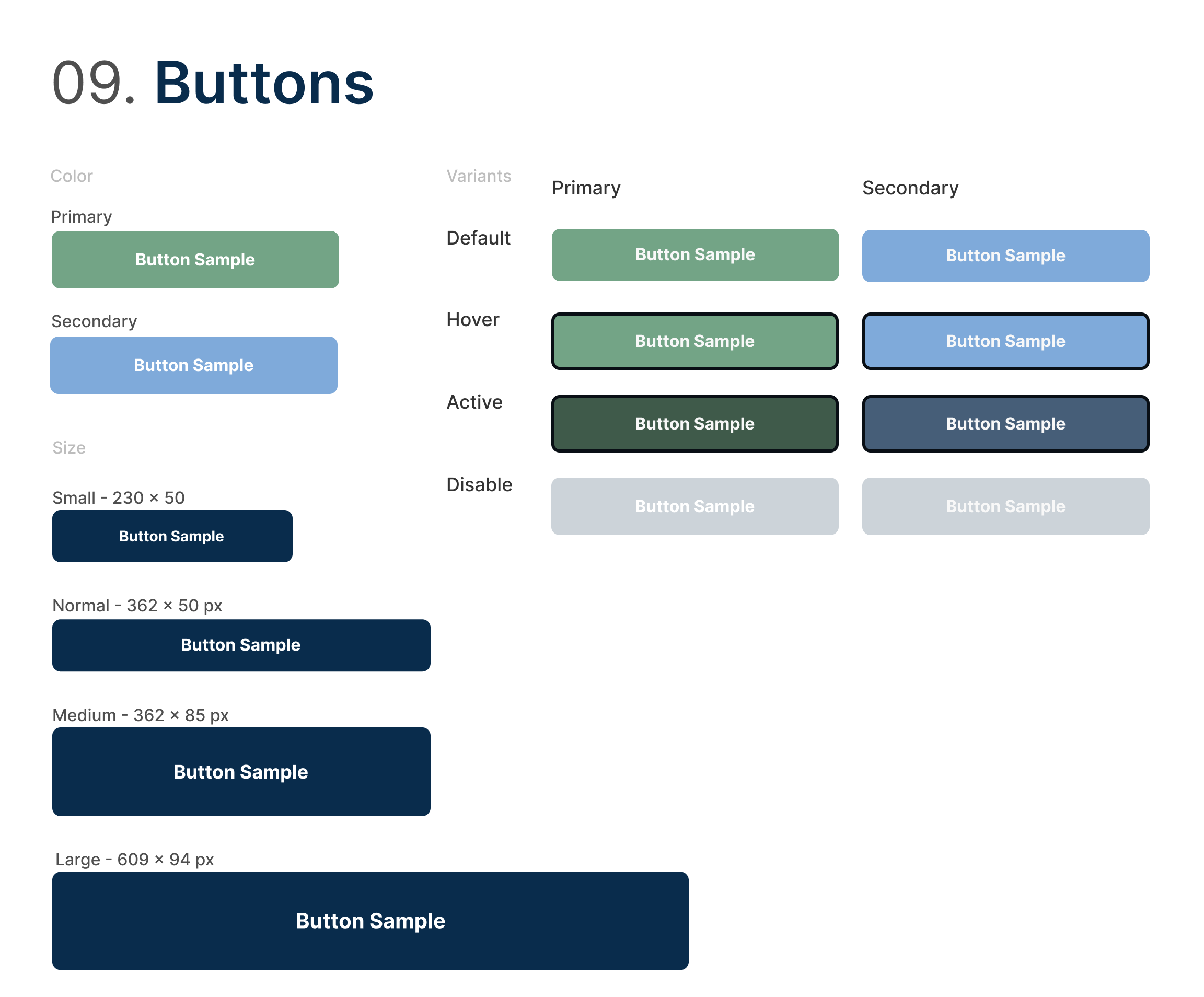
For the buttons I used green for conversion and blue for secondary functions.
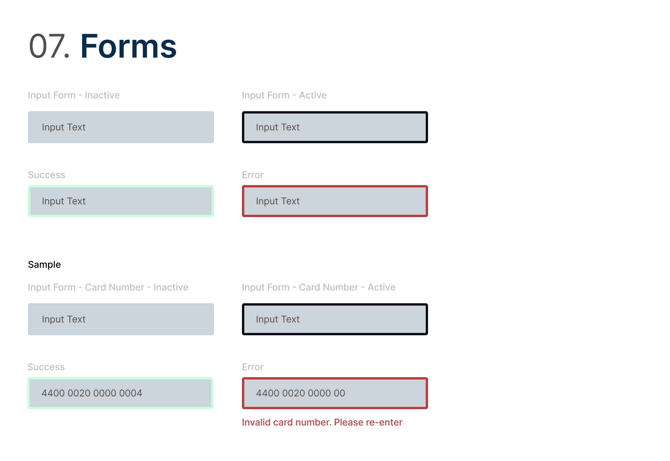
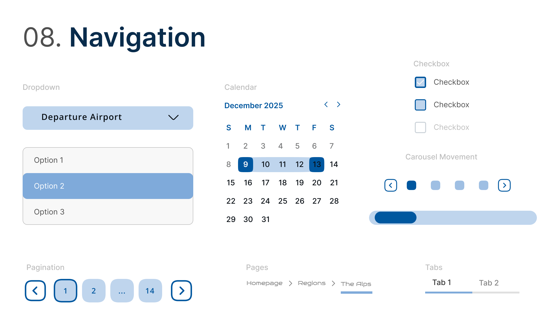
Design System


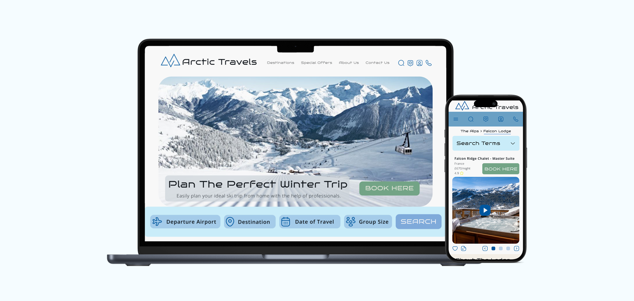
The home page features enticing imagery to draw users in. It breaks down their search by “regions”, “resorts”, “lodges” or “passes” or to explore the spotlight offers and bestsellers.
The brand is highlighted with their experts section, features and reviews. The stand out feature is the “book here” CTA which is the main focus of a users visit to the site which is to book a holiday.
The destination page illustrates the range of stays based on the users chosen search terms. Each product card has a clear image and ability to see more by the CTA “view trip”.
The booking page features a full breakdown of the stay selected along with the ability to contact customer service or view similar stays, allowing the user to remain in control.
The payment page is clear and includes the trip summary for ease.
The confirmation page allows users to download an itinerary or add extras.
Final Designs
Conclusion
One of the successes of this project was throughly undertaking user research to enhance my designs. The user research revealed several friction points in mainstream travel sites such as cluttered search pages, hidden fees, and generic upsells. By mapping those findings directly to my designs such as reducing the amount of options on search pages, including a side by side trip summary for transparency and contextual upgrades upon confirmation of the booking, I closed the gap between what users complain about and how my UI behaves.
One of the challenges of this project was dealing with the amount of content and ensuring that it translated well across both desktop and mobile. To ensure that both interfaces were optimised, I altered the layout and text content accordingly.
Overall, the double diamond structured approach helped ensure that every design decision was rooted in user insight and aligned with Arctic Travels' business objectives and to understand the target users in order to translate a premium brand vision into a cohesive, user‑centred interface.
By applying principles such as Hick’s Law, I focused on reducing cognitive overload throughout the booking journey. This meant presenting users with clear, limited choices at each step, especially during key moments like selecting regions, lodging, or passes. By simplifying decision-making, the experience became more intuitive and efficient.The final design balances freedom and simplicity, empowering users to plan confidently without feeling overwhelmed.
High Fidelity Desktop

Interactive prototype preview of Arctic Travels mobile website.
Click the arrows to navigate.