
Artisan Bakery Co.

Role


Tool
Timeline
The Problem
Artisan Bakery Co. lacked a dedicated digital presence, making it difficult for potential and existing customers to discover their products, engage with the brand, or access key information such as opening hours, product offerings, and location.
In a digital first world, especially for small local businesses, having a responsive and user-friendly website is essential for reaching their target audience which is local residents and food enthusiasts who value quality and community.
The Solution
Without a website, the bakery missed opportunities to showcase its handcrafted products, share its story, and build a loyal online customer base through digital orders. Therefore, a website was required to reflect the bakery’s rustic, welcoming aesthetic, provide a seamless user experience across desktop and mobile, and communicate its core message: “Handcrafted. Heartfelt. Homegrown.”
To help Artisan Bakery Co establish a strong online presence, I designed a responsive website that captured the brand’s rustic warmth while remaining functional and easy to navigate. I began by analysing the customer journey and mapping out key user flows to ensure browsing, story exploration, and ordering felt smooth across devices.
To avoid overwhelming users with too much content, I structured the homepage into scrollable narrative sections such as “Inside the Bakery” and “Community Feedback” which balanced storytelling with clear product CTAs. This layout created a rhythm between emotion and action, encouraging engagement without clutter.
I developed a consistent spacing and grid system to prevent layout inconsistencies and reduce unnecessary white space as new content was added. Responsive testing across devices helped fine tune alignment, readability, and accessibility.
Throughout the process, I iterated between wireframes and high-fidelity prototypes to test visual hierarchy and flow, ensuring every element supported the bakery’s message: “Handcrafted. Heartfelt. Homegrown.”
The final design translates the bakery’s identity into a cohesive digital experience balancing emotion and function through thoughtful storytelling, structure, and user-centred design.
Double Diamond Design Process


Discover & Define
Moodboard
To kickstart the design process, my moodboard played a central role in discovering and guiding the aesthetic and functional direction of the Artisan Bakery Co. website. Thorough research allowed me to establish the tone that I was going to follow to illustrate the bakery’s core values of handcrafted quality, community focus and a welcoming down to earth atmosphere.
As an artisan bakery, my target audience is a wide range of customers within the local community, specifically families who crave fresh daily produce and foodies seeking high quality products with local ingredients. Therefore, it was important to evoke a sense of welcoming in the design for the bakery.


1. The top row of images showcased key inspiration for my design: the first bakery’s wooden exterior and fresh display captured a rustic, homemade feel; the second’s tagline, “Happiness Comes in Batches,” inspired my sample copy; and the third reflected handcrafted produce.
2. The second row focused on typography and colour. Block capitals influenced my typeface choices, while wooden interiors shaped my warm, rustic palette. Gail’s red typography informed my palette exploration, though it felt too bold for the brief.
3. The third row highlighted fresh ingredients, traditional techniques, and hand packaged goods, reinforcing the bakery’s authentic, homegrown character.
4. When selecting typefaces, I aimed to evoke familiarity. My research showed that artisan bakeries often use clear, modern block capitals for a balanced look. I experimented with Baskerville, Futura, and Avenir and found Avenir Heavy the most suitable due to its approachable warmth tone and readability.
5. From my research, I knew the colour palette should feel warm and welcoming rather than bright or vibrant. I wanted it to reflect a homely yet high-quality atmosphere, so I kept it simple using the 60/30/10 rule for balance.
6. For my sample copy, I researched artisan bakeries and was inspired by Gail’s slogan, “Making Good Food Go Further.” I wanted to capture a sense of warmth, craftsmanship, and community. After exploring ideas like “Crafted with Care, Baked for Community,” I refined it to “Handcrafted. Heartfelt. Homegrown.”
User Flow
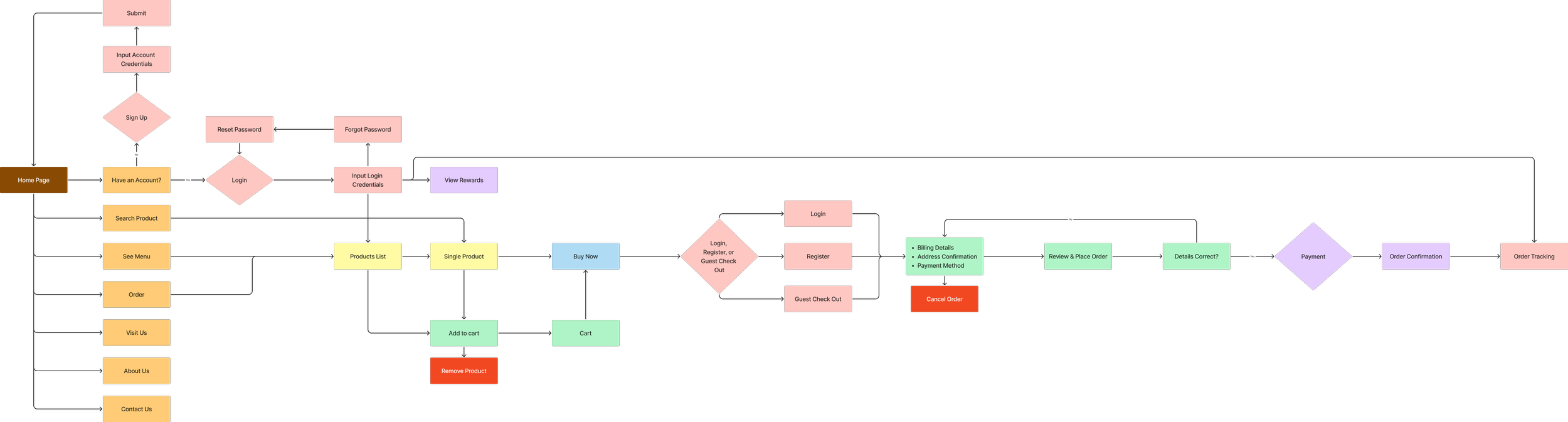
The user flow for the Artisan Bakery Co. website was carefully designed to define a logical, intuitive experience for users navigating the site. The user flow begins with the Home Page, branching into essential sections such as Search Product, See Menu, Order, Visit Us, About Us, and Contact Us. These top level categories reflect typical user goals and ensure that both new and returning users can quickly find the information they need.
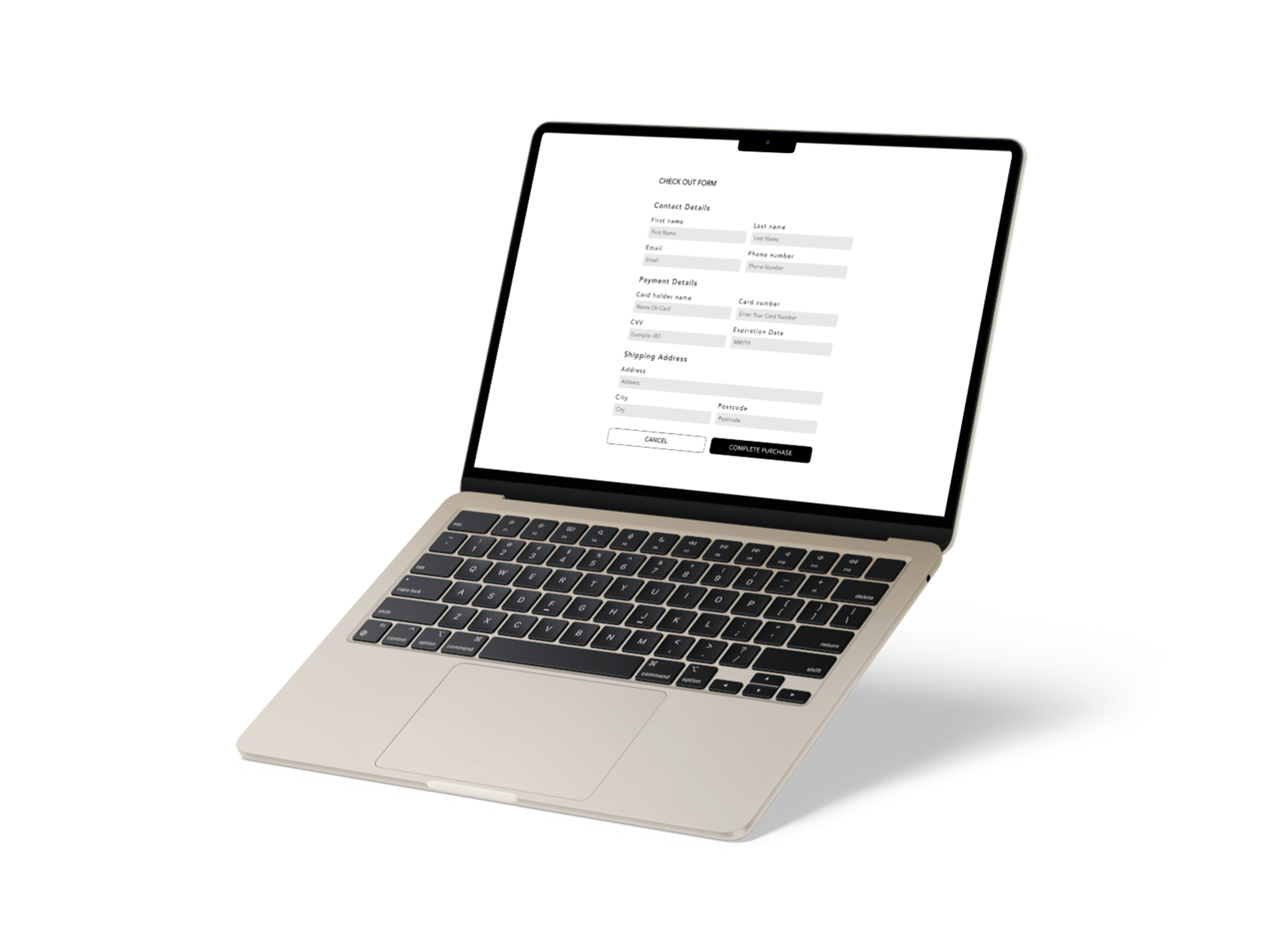
The user flow guides visitors through key processes like browsing products, account management, and placing an order. Actions such as signing up, logging in, resetting passwords, and guest checkout are all mapped out in a way that minimises friction and decision fatigue. The checkout process is designed with flexibility, offering users options to log in, register, or proceed as a guest. Once in the cart, the flow moves through logical stages: billing, address confirmation, payment, and finally, order confirmation and tracking.
Visually structuring the flow helped ensure the experience supports users at every step from discovering baked goods to completing a purchase, whilst also aligning with the bakery’s emphasis on warmth and ease ensuring that the digital experience mirrors the welcoming, handcrafted feel of the physical bakery.

Develop & Deliver
Wireframes
Desktop
As part of my design process, I chose to wireframe the desktop and mobile pages for the landing and menu pages for the website. In order to create the mid-fidelity wireframes, I began by defining the user goals, business objectives, and core content based on the brief. Each screen was planned to reflect the bakery’s emphasis on handcrafted products in line with the user flow where the end goal is to purchase.
I prioritised clear, consistent navigation, starting with a strong homepage that includes call-to-actions (CTAs) like Order, See Menu, and Visit Us. I structured the menu page by product categories (e.g., Pastries, Sweet Treats, Bread, Savouries), ensuring content was scannable and adaptable to mobile. This dual-device approach helped me consider responsive layout decisions early in the process.
My main focus was to ensure that the products were highlighted and enticing to draw in new and existing users. This included using large product images and community feedback to provide credibility to the products.
Mobile
Wireframing is a critical part of the UX design process because it allows for fast iteration and feedback. It helped me clarify the flow of information and user journeys without getting distracted by visuals. This step allowed me to validate layout decisions, organise content hierarchically, and ensure accessibility and responsiveness before investing in full visual design or development.
A challenge I faced was designing for mobile without overcrowding the screen and balancing the white space. I solved this by removing unnecessary white space on both the desktop and mobile pages, simplifying the mobile navigation with a collapsible menu, stacking content vertically, and ensuring all buttons (like “Order,” “See More,” and “Add to Cart”) were thumb-accessible and clearly visible.
Desktop Wireframes
Design System
A design system is a comprehensive collection of reusable components, guidelines, and assets that define the visual language and user interface elements of a digital product. It typically includes things like typography, colours, iconography, spacing, components (e.g., buttons, icons, forms), and layout grids.
Design systems are essential for:
Consistency: Ensuring a unified look and feel across all pages and platforms (desktop and mobile).
Efficiency: Enabling faster design and development by reusing predefined components.
Scalability: Supporting future growth without losing brand cohesion.
Accessibility: Providing rules that help meet usability and inclusive design standards.
For this project, I developed a full design system that visually reflects the brand’s warm, handcrafted, and community focused identity whilst maintaining modern usability principles. Here’s a breakdown of its key components:
Mobile Wireframes
Familiar status colours to reflect error and success states throughout the design supporting usability in line with Jakob’s Law as they are commonly used across other websites.
I chose to keep the logo in a monochrome font so that it is flexible to use and impactful across print, digital and low contrast environments.
I chose universally recognisable icons, like a magnifying glass for search and a person for profile, to ensure easy navigation and build trust through familiarity, aligning with Jakob’s Law.
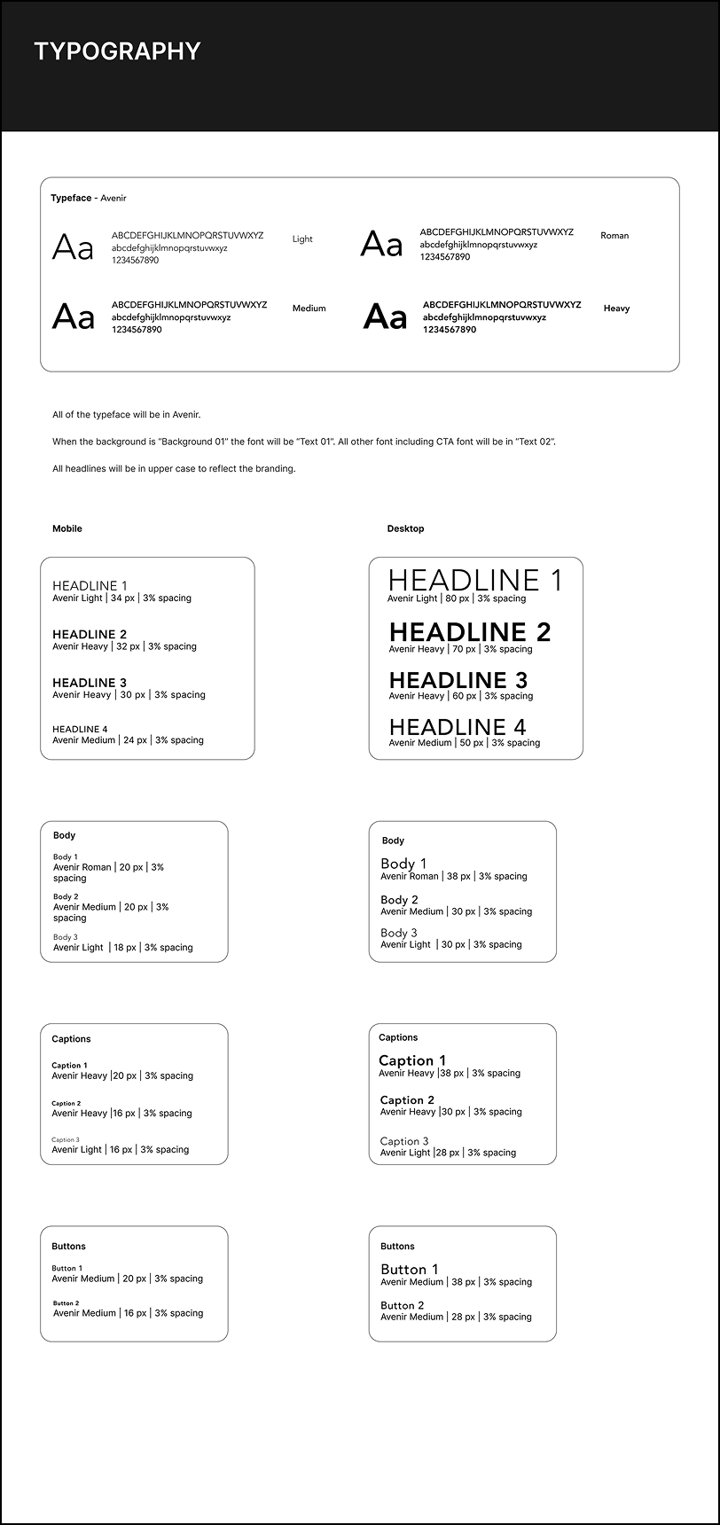
The typography guide ensures consistency for responsive design across the desktop and mobile ensuring accessibility and readability on all screen sizes. This keeps the experience seamless without compromising hierarchy.
In order to reflect the brands identity, I chose the Avenir typeface group (Light, Roman, Medium, Heavy). Avenir strikes a balance between modern simplicity and subtle warmth. It mirrors the Artisan Bakery Co.’s blend of tradition and contemporary appeal.
I chose to make all of the headlines uppercase type to give them more visual impact and brand presence, which helps reinforce identity. This also creates a clear distinction between headings and body content.
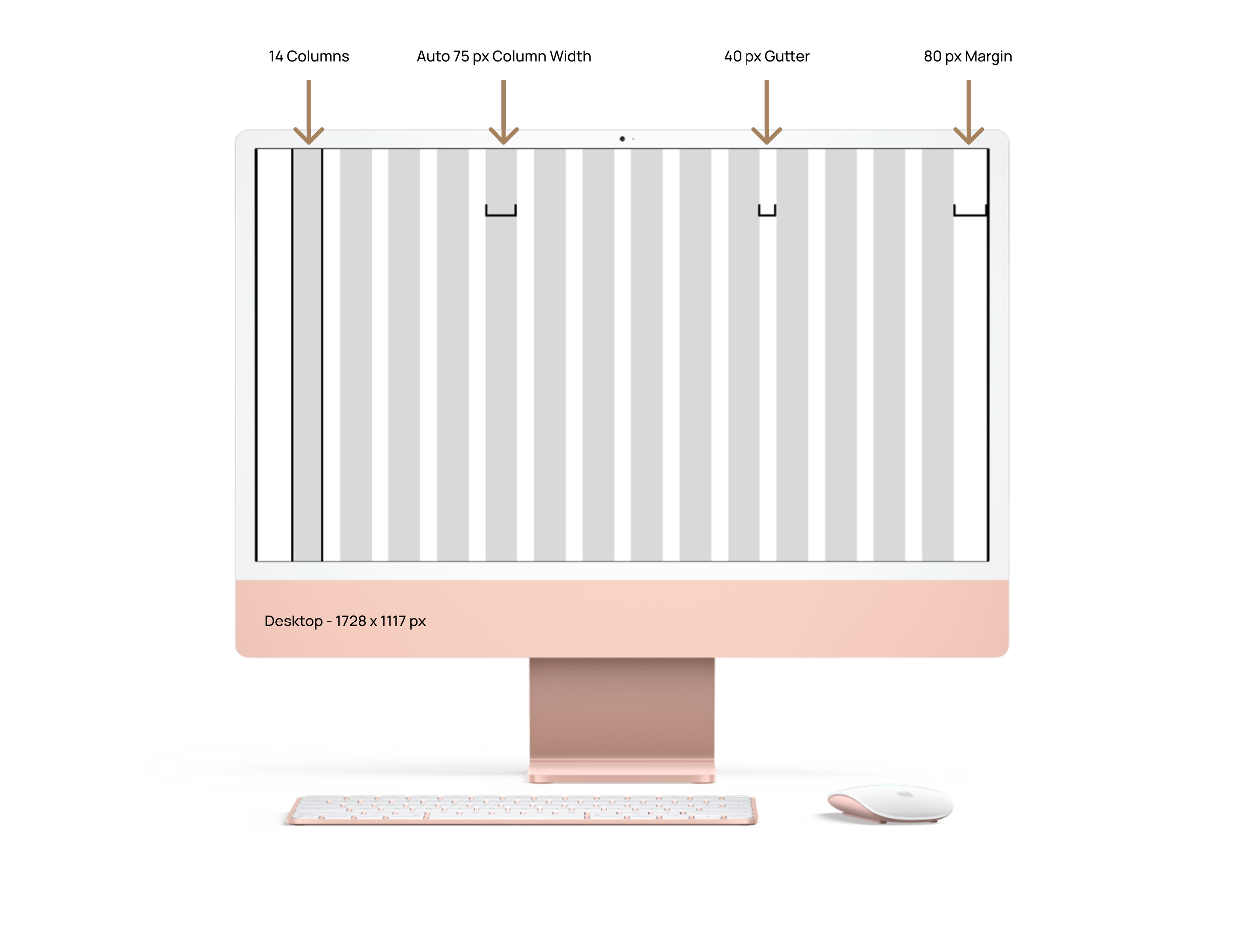
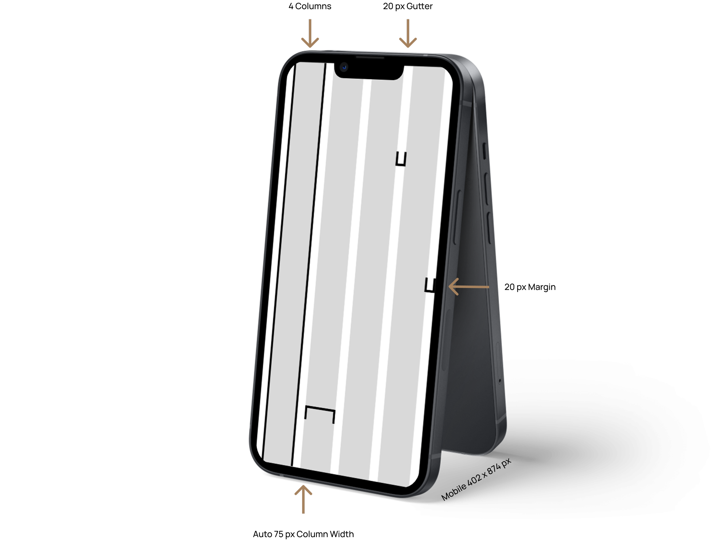
The grid layout and spacing choices follow standard responsive practices and visual hierarchy.
They allow for flexible layouts whilst maintaining structure which is especially helpful for aligning content and avoiding design inconsistencies as well as enhancing both usability and aesthetics.

I ensured that my design was responsive by including colour and opacity changes to reflect immediate feedback on the status of the button between default, hover and disabled, improving usability and interactivity. This also helps visually impaired users to understand action availability.
All buttons and navigation elements scale according to the interface to maintain accessibility compliance with the Web Content Accessibility Guidelines across platforms.

The imagery guide provides for defined, consistent dimensions for each type of content (product, perks, carousels, feedback) to help maintain visual alignment, load efficiency, and responsive behaviour.
I have placed error messages beside the relevant fields to help users understand and correct issues instantly, improving form completion rates and user satisfaction.
I have also included indicators like password strength and “show/hide” toggles to reduce user frustration and support good security habits.
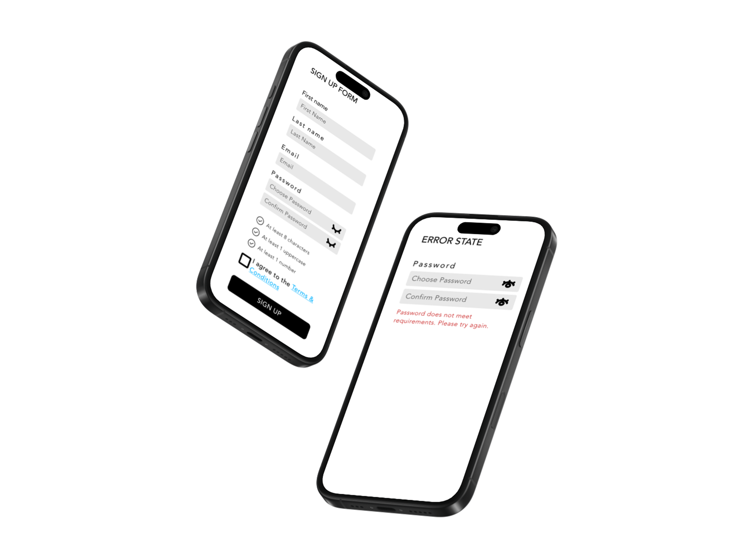
The form fields are evenly spaced and clearly labeled, reducing cognitive load. This aligns with best practices in usability and the Law of Prägnanz which states that the user will perceive and interpret elements in the simplest forms.
The goal of the final design was to bring Artisan Bakery Co.’s values to life. The website needed to feel warm, trustworthy, and locally rooted, while also being functional and easy to navigate for users who want to explore products, place orders, or learn about the bakery.
I designed the final interfaces ensuring that I kept the warm & rustic aesthetic by using a neutral colour palette (browns and beiges), and organic imagery to reflect the handcrafted nature of the bakery. I highlighted the products by using large imagery to draw the users attention.
I wanted to create a user-friendly shopping experience so I chose clear product categorisation (Pastries, Sweet Treats, Bread, Savouries) on the menu page to support easy browsing and ordering.
I included community driven message sections like “Inside the Bakery”, “Community Feedback”, and “Rewards & Perks” to reinforce local engagement and loyalty.
Final Designs
My final screens reflect my user flow as I have clearly marked buttons such as “Order,” “Visit Us,” and “See Menu” on the homepage to direct users based on their goals. I also have product browsing to help users find specific items with options to add to cart directly from the product grid. Everything flows logically and intuitively, minimising friction.
My final screens also reflect my wireframes which were fundamental in ideating my final design. On both the landing and menu page, the grid layout for product cards with imagery, pricing, quantity selectors, and “Add to Cart” buttons were executed just as planned with responsive stacking in mobile view ensures each product remains readable and easy to interact with.
Minor changes were made to the wireframes and final designs to remove unnecessary whitespace to allow for seamless transfer between the elements across the interfaces and minimising user distraction.
High Fidelity Desktop
High Fidelity Mobile
Conclusion
Successes
Translating the bakery’s brand identity into a consistent digital experience from idea generation to final designs.
Responsive design to make handoff smoother and support accessibility.
Challenges
Avoiding an overwhelming the product experience - To counteract this, I broke the homepage into clear, scrollable sections allowing storytelling content like “Inside the Bakery” and “Community Feedback” to sit alongside product CTAs in a balanced, non-intrusive way.
Unnecessary white space, especially as more content was added - To resolve this, I relied heavily on my spacing system, grid layouts, and text styles to keep everything aligned. Frequent testing across devices helped identify and fix any inconsistencies early.
What I Learned
The importance of a strong foundation to make the entire design process more efficient and intentional.
Iteration between wireframes to final designs is essential to refine ideas based on what actually works visually and functionally.
How to move from abstract brand values to tangible, usable digital design by balancing emotion and function.
Key Takeaways
Ensure user-centred design is optimised efficiently, by identifying the problem and/or pain point needs at the outset in order to begin to work on the solution and design.
Iteration strengthens my skills in responsive design, UX strategy, and design system thinking.