
Citizens Advice Redesign
Role


Timeline
Tool

The Problem
The existing experience is trusted but the UI was rigid, the navigation was inconsistent and there were several accessibility gaps (contrast, focus states, small call-to-actions). Users struggled to find the right starting point to turn advice into action.
The Solution
This was a self-initiated UX redesign of Citizens Advices’ online legal advice website. The goal was to improve accessibility, streamline and modernise the website by simplifying the user flow and clarifying legal jargon.
To address the accessibility and usability challenges of the existing Citizens Advice website, I began by mapping the existing user flow and identifying where users hesitated or dropped off. I then restructured the information architecture to present topics through plain language categories and clear calls to action, helping users find the right starting point faster.
To reduce cognitive load, I introduced plain English prompts and progressive disclosure, allowing users to digest legal advice step by step rather than in dense paragraphs. The visual design adopted larger typography, generous spacing, and simplified layouts optimised for mobile.
A modular design system was developed using reusable tokens and components so that improvements such as accessible colour palettes and consistent icons could scale across future pages.
The interface was redesigned using consistent navigation patterns, improved visual hierarchy, and WCAG-compliant contrast ratios. Focus states and button sizes were enhanced for keyboard and mobile users to ensure full accessibility.
The result is a more direct, inclusive, and intuitive experience that helps users move from confusion to confident next steps, with clearer pathways to find and act on legal help.
Double Diamond Design Process


Discover & Define
The double diamond framework guided my thought process throughout this project. The discover process involved a brand study and user research to understand the problem.
Due to my experience within the legal industry, I was aware that the current Citizens Advice website was difficult to navigate. Users struggled to find starting points, pages felt text-heavy, and there were several accessibility gaps (contrast, focus states, small call-to-actions) made advice hard to seek on mobiles.
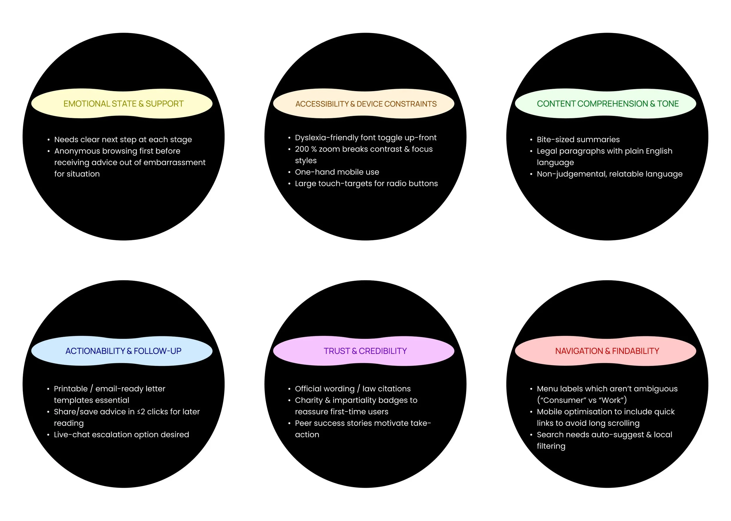
I conducted user interviews with target users to identify their needs. Below are the user personas:
User Personas


The define process involved collating the research findings from the interviews to ascertain the users needs and develop a “How Might We” question:
“How might we design a modern and accessible legal advice website that is free of legal jargon to allow users to easily navigate and solve their problems?”
Below is the affinity map:
Affinity Map

I created a new information architecture to structure the website in a way that was easier for users to navigate by removing the clutter on the homepage and adapting the content into clear actionable steps.
Information Architecture
The user flow then follows the user journey for an individual seeking advice for a refund, repair or replacement of an item. I kept the structure of using an online tool to obtain the advice but streamlined the pages to get through to the tool to allow the user to easily obtain the advice without being overwhelmed. I also considered how the advice would be given and decided that it can only be achieved by going through the tool.
User Flow

Develop & Deliver

I created my wireframes based on the existing website layout but considered making it more interactive by including imagery and icons, as well as clearer navigation to allow users to easily find the right tools to seek their advice.
I followed the user flow above to develop 6 screens from landing on the homepage to receiving advice:
Wireframes

The first page shows the landing page which includes more call-to actions and imagery than the existing home page.
The next page showcases the start of the online tool with straightforward advice to be represented here.
The third page shows the start of the tool, as well as a progress bar to clearly indicate to users where they are in the process.
The fourth and fifth page shows the user journey through the remainder of the tool as well as easy navigation back and forth between the pages should the answers need to change.
The final page of the wireframe shows the advice to be given as well as further interactive call-to-actions to provide options to the user on how to action their advice.
Design System
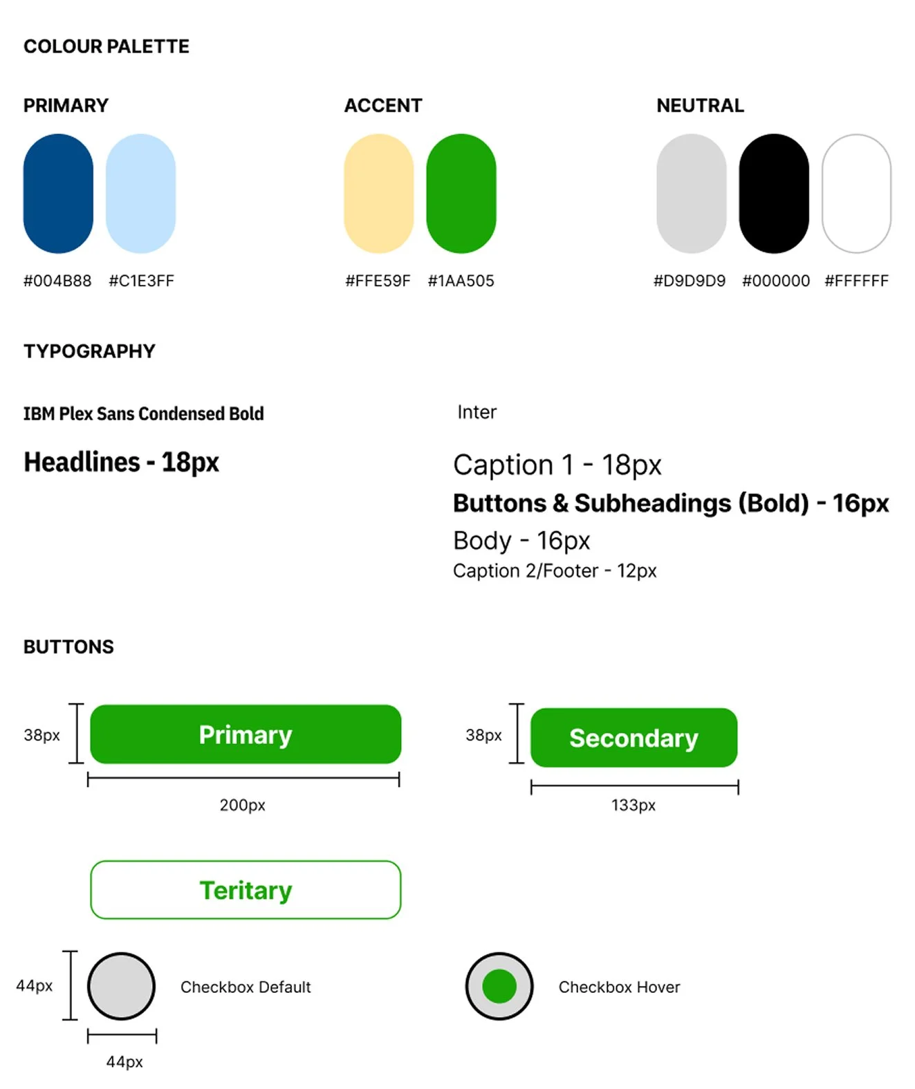
The design system defines a clear, accessible foundation for the rebrand. I kept in line with the original brand style by using a primary blue to establish trust, while a vivid action green and a warm sand accent draws attention to key CTAs.
The Typography balances character and readability by using IBM Plex Sans Condensed Bold for compact, authoritative titles, and Inter for long form text. Components follow consistent sizing and accessible targets in line with WCAG 2.2.
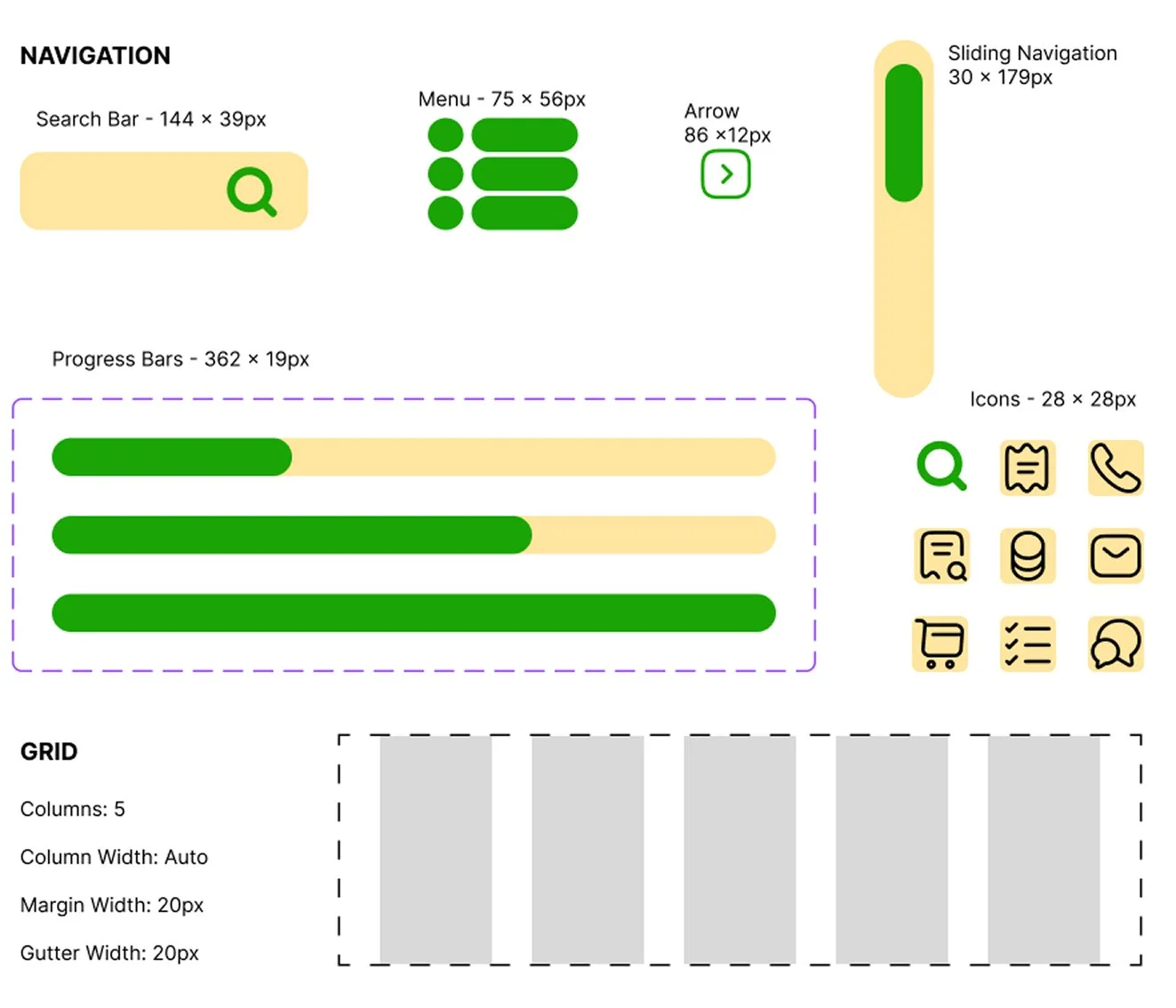
The navigation patterns (search bar, menu, slider) provide a clear user journey. The layout is responsive so that it can be further adapted for desktop and tablet.
I amended the homepage by creating a single, dominant “Get Advice” CTA plus a large search field anchor so that the user has to make fewer decisions on entry and there are fewer clicks to get to the final advice. I collated popular topics and tools to get to the most viewed options immediately. This meant that the information was no longer buried in numerous clickable links.
The refund, repair or replacement tool was also streamlined to include a short plain English explainer that leads into a prominent Start Tool button. The copy reassures users that rights apply to new or second-hand goods, reducing abandonment.
I then ensured that the steps were guided with clear radio buttons to ensure one answer responses for personalised advice. As well as a progress bar to allow the user to see how far they have come and how far is left. Questions cover where purchased, when purchased, and issue type, mapping directly to the legal decision tree.
A highlighted summary banner states the outcome (“You are entitled to a refund, repair or replacement”) followed by Save/Download advice actions.
Final Designs

Explore the Prototype
This was a self-initiated UX redesign of Citizens Advices’ online legal advice website. The goal was to improve accessibility, streamline and modernise the website by simplifying the user flow and clarifying legal jargon.
The existing experience is trusted but the UI was rigid, the navigation was inconsistent and there were several accessibility gaps (contrast, focus states, small call-to-actions). Users struggled to find the right starting point and to turn advice into action.
The goals were to simplify the navigation, use plain language, improve mobile experience and reduce the time to find relevant legal aid.
The redesign used plain language prompts and included mobile-friendly layouts. The final prototype aims to reduce drop-off and help users feel confident when asking for legal help.
This project helped me deepen my UX process, especially around designing for accessibility and clarity in high-stress situations. I also realised how much my legal training shaped my approach to structure and information hierarchy. If I had more time, l'd like to run a formal usability test with real users and measure time to complete.
Designing for advice services is as much about emotional state as it is about UI. Clear first steps, plain English, and strong accessibility are the biggest levers. Systematising those decisions in tokens and patterns means improvements travel with every new page.
Overall, the rebrand turns a trusted but heavy experience into one that is direct, inclusive, and action oriented to help people move from confusion to confident next steps, faster.
